
As a web designer, finding ways to enhance your creative abilities and streamlining your workflow is an important but sometimes difficult beast to tackle. That's where a personal web design template or style guide comes into play.
By crafting a style guide that's uniquely yours, you not only speed up your design process but also ensure a consistent and high-quality output across all your projects.
This guide is my way of walking you through the creation of a web design template, emphasizing efficiency and simplicity. Let’s dive in.
Important Note: In this article I describe all measurements in terms of pixels, but I recommend that you actually use REMs when it comes to development.

Step 1: Container Size and Consistency - Where It All Begins
Understanding the Backbone of Your Design
Before getting lost in colors and fonts, let’s talk about something fundamental yet powerful: container sizes. Believe it or not, but the sizes of your content containers on your website can dramatically influence how it feels.
The way I think about it, the smaller the container size, the more formal, legible, and educational your design can feel. When you use large container sizes, the content spans more of the width of the screen, creating an immersive effect that catches peoples attention.
Think about any Wix, Square Space, or Shopify websites you’ve seen. They’re almost always container-less, spanning the full width of the page, with the goal of making their website templates visually appealing to their customer base— who then goes and ruins the template they purchased because they don’t know the first thing about what makes good website design.
But that’s not you, is it? Of course not. You’re going to build beautiful and functional websites for your clients.
It can be tempting to copy these company’s container-less designs, but let’s make something clear. They suck. They’re often times hard to read, rely too heavily on imagery, and don’t actually convert customers as much as they advertise— unless professionally edited by someone like you.
My Go-To Container Sizes
I suggest kicking things off with three main container sizes: large, medium, and small. Start with the largest container you plan to use (like 1600, 1400, 1280 etc.). From there, a medium container works wonders for center-aligned sections like FAQs that shouldn't stretch too wide. Meanwhile, small containers are your best bet for denser, long-form content, making blogs (like this one) or educational articles easier on the eyes.

Step 2: Typography and Readability
Selecting Your Font Weights Wisely
Let’s talk typography, specifically font weights. It’s easy to hop into your designer of choice and upload every font weight available “just in case you need it”, but I’ve noticed that designers usually don’t need every font weight, and when you’re only stepping up by 100 at a time, it can be hard to notice.
I've found that keeping it simple, and spacing your font weights out by 200 is better.
This does wonders for clarity and distinction. It’s a small change that can significantly impact how your content is perceived and understood.
Achieving Harmony with Typography Sizing
Just like with font weights, consistency is key when it comes to font sizes. Sticking to even numbers and scaling them in multiples of 4 (think 12, 16, 20, 24, and so on) has never steered me wrong. It’s visually pleasing and just feels right.
If you’re looking for a more mathematical or theoretical structure, say, following ratios and harmony (like the golden ratio, perfect fifths and so on), tools like Typescale or Golden Ratio Typography (GRT) are something you can turn to. You can also just ask ChatGPT to give you a sizing ratio for your fonts if you’re into that.

Step 3: Nailing Spacing and Alignment
Embracing the Space
Whitespace, or the lack thereof, can make or break your design. It’s all about balance. I aim for consistent spacing, usually in multiples of 8px (like 8, 16, 24, 32, 64 etc.), to give each element its own space to be appreciated. This approach ensures my designs feel organized and breathable.
Consistent Spacing Made Easy
To keep spacing uniform across my designs, I’ve leaned towards creating custom classes for spacing, applied to div blocks. It’s a game changer, especially if you’re dabbling in Webflow. By the way, if you are dabbling in Webflow — A class naming convention and design style guide like Finsweet’s Client-First not only saves me time but keeps things neat and tidy. I highly recommend you look into it.
Step 4: The Color Scheme Conundrum
Starting Simple: Black and White
Believe it or not, beginning with just black and white in your design can be incredibly freeing. This minimalist approach not only sharpens your focus on layout and spacing but also sets a solid foundation for adding color later. It’s like sketching before painting—you outline the essentials first.
Applying Color with Purpose
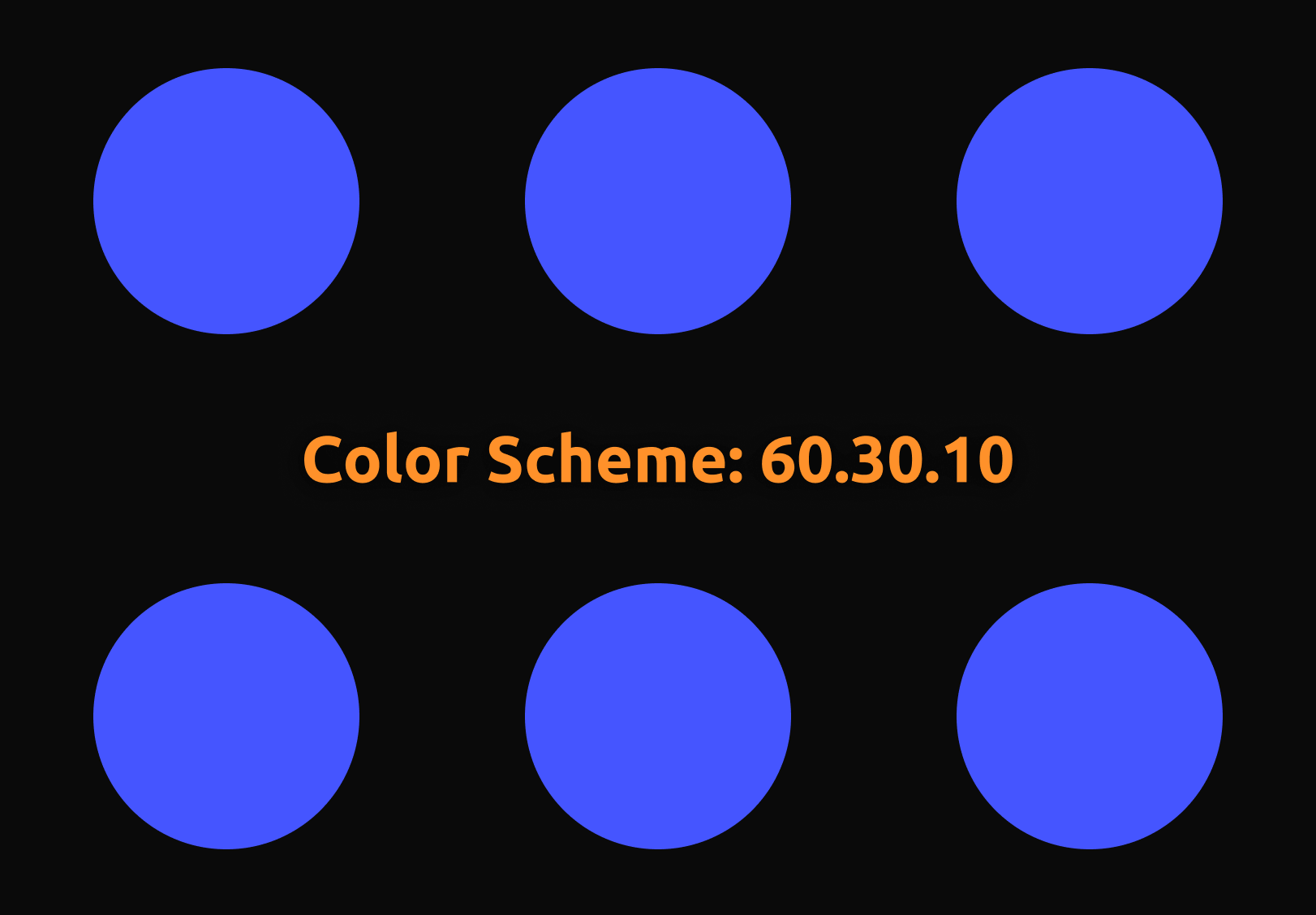
When it comes time to introduce color, and when possible, I adhere to the 60.30.10 rule. It’s a classic interior design principle that also works wonders in web design. But remember, black and white already count as two colors. If your brand or project demands additional hues, pick one for the background and another for standout elements like CTAs.
For example: Let’s say I need to have orange and blue in my design, as well as a reasonable background color and text color that’s legible (That’s theoretically four colors, which can get tricky). Try first using blue as your background (60%), white as your text color (30%), and orange as your accents and call to action buttons (10%). This will ensure the user’s eyes are guided properly through the document, and makes it easy for them to know what they should be paying attention to.
Obviously this won’t work for every design, but it gets the job done most of the time.
If you must use four (or more) colors, try dividing the last 10% in half between the most visually stimulating colors. Touching on the example above, you could use black as a background, white as your text color, and then apply small amounts of blue and orange throughout the design to guide the user’s journey.
Tools like Coolors, Adobe Color, and Color Hunt are great for choosing a color palette.

Step 5: Fonts That Speak to Your Brand
You may be wondering why I didn’t touch on font styles in step 2 of this design template guide, and to be honest, I don’t really know… But we’re doing it now.
The Reign of Sans Serif
Sans Serif fonts are today’s bread and butter. They’re modern, readable, and just versatile enough to fit into any design aesthetic.
But remember, the key is not just picking a font—it’s choosing one that resonates with your brand’s voice. If your client’s brand calls for a regal looking serif font, get after it!
Less Is More
If there's one piece of advice that's always served me well, it's this: simplicity wins. Often, using just one font can be incredibly powerful. But if your heart is set on mixing fonts, try sticking to two—a primary font for headings and a secondary font for everything else. It keeps things cohesive and your message clear.
Exploring Font Pairings
While Sans Serifs dominate my designs, I’m no stranger to mixing it up. Pairing a Sans Serif with a Monospace font, for example, can add an unexpected twist. It’s all about balance and harmony. A site I built for fun recently NextGen Innovations showcases how striking the right pair of fonts can add a touch of chaos and uniqueness to your designs, and them still a practical choice.

Step 6: Carving Out Your Unique Visual Theme
Finding Your Design Signature
Every designer has a toolkit of elements that define their unique style. For me, it’s all about finding one key visual theme that ties everything together. This could be anything from SVG shapes to bespoke illustrations. Having some go-to tools to add to your design template can make this process much easier.
SVG design tools like FFFuel, Magic Pattern, Get Waves, and Blob Maker, or illustration packs like Streamline HQ and Many Pixels are treasure troves for elements that can set your design apart.
Integrating Your Theme
Once you've chosen your theme, weave it into your design in ways that complement rather than overpower. This cohesion is what can turn a good design into a great one. One way I think about the overall use of these theme elements, is to view them as kind of like a thread that runs down the page. Your addition of these graphics should bind together each section of your design. The ‘user journey’ and all that, right?
Here’s an example from my client work where I used one simple graphic (a wave SVG) to tie together sections of the website, and create a visually appealing flow as you scroll down the page. Banded Glass.

Step 7: Putting It All Together
Embrace the Design System
With all these elements at your fingertips—container sizes, typography, spacing, color schemes, fonts, and visual themes—you're not just designing; you’re creating a design system. This system is your blueprint, making the design process smoother and letting creativity flow without barriers.
The Creative Freedom of Guidelines
Having a set of rules and guidelines to follow doesn't limit creativity; it enhances it. It’s like having the bricks, tiles, and two-by-fours needed to put a house together.
Imagine if you had to go find and then process rock and clay, and then chop trees every time you wanted to build a house… You’d struggle to get things done in a reasonable amount of time.
Creating my own website design template and style guidelines has liberated me from decision fatigue and allowed me to focus on what truly matters—crafting beautiful, functional web designs.
Now it’s your turn
Now, armed with these steps and insights, it's your turn to create. Remember, these guidelines are not set in stone. They’re here to inspire and to serve as a foundation on which you can build and innovate. Dive in, experiment, and discover what makes your design heart beat fastest.
Get in touch!
And there you have it— If you’ve got questions or want to dive deeper into any of these steps, feel free to reach out. I’m always eager to help or learn from others about this stuff. Happy designing!


