
18 Common Website Mistakes and How to Avoid Them

The top 18 website mistakes That Could Be Costing You
If you're looking to maximize your online presence and drive more business through your website, it's important to avoid some common pitfalls that can sabotage your efforts.
Today, I'm going to break down the top 18 website mistakes and provide solutions to avoid them. Plus, I’ll explain why hiring a professional web designer can save you time, money, and headaches in the long run.
Let's get started!
Mistake 1: Lack of a Clear Value Proposition
Explanation:
Your value proposition is the first thing visitors should see when they land on your website. It’s a clear statement that explains what you offer, who it's for, and why it’s valuable. Without a clear value proposition, visitors can get confused and leave your site without exploring further.
Solution:
To create a compelling value proposition, focus on the benefits your product or service provides. Keep it concise and ensure it's prominently displayed on your homepage. A professional web designer can help articulate your value proposition effectively and integrate it into your site’s design.
Here's Some Examples of Strong Value Propositions:
- "Streamline Your Operations with Our Cutting-Edge Project Management Tools - Empowering Teams Worldwide."
- "Experience Seamless Communication with Our Advanced Video Conferencing Platform - Trusted by Global Enterprises.
- "Enhance Your Skills with Our Comprehensive Online Courses - Learn from Industry Experts."

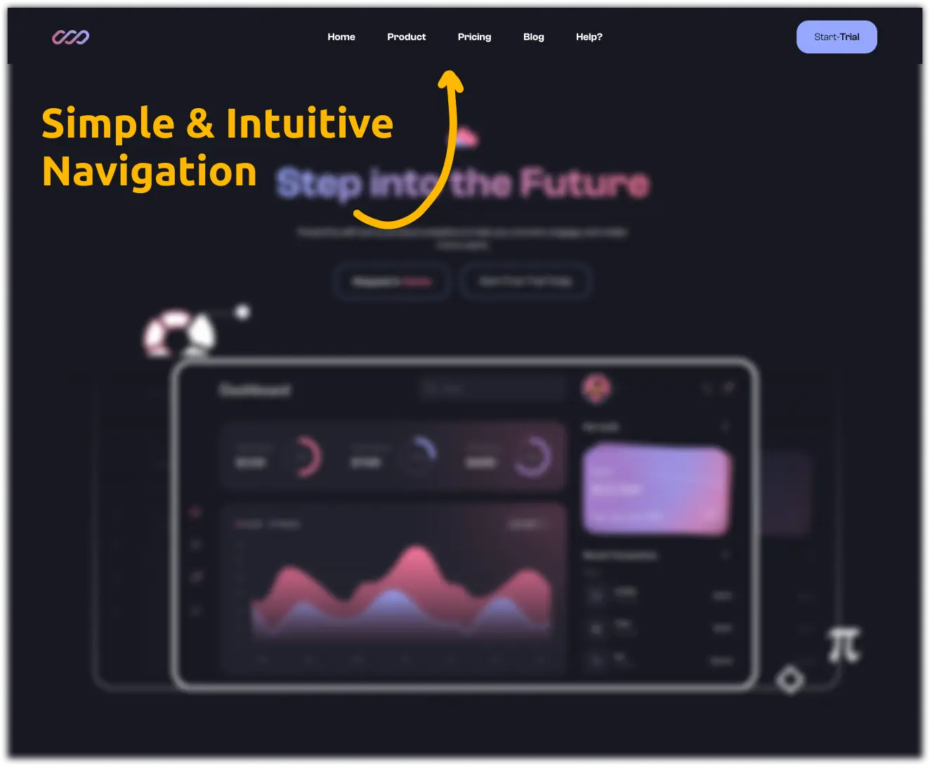
Mistake 2: Poor Navigation
Explanation:
If visitors can't find what they're looking for quickly, they'll leave your site. Poor navigation leads to a high bounce rate and frustrated users. Navigation should be intuitive and straightforward.
Solution:
Use clear labels for menu items and organize them logically, for example: instead of vague terms like "Solutions," you can use specific labels like "Services" or "Products." Limit the number of menu options to avoid overwhelming visitors. A web designer can smooth-up your navigation, making sure users can find important information.
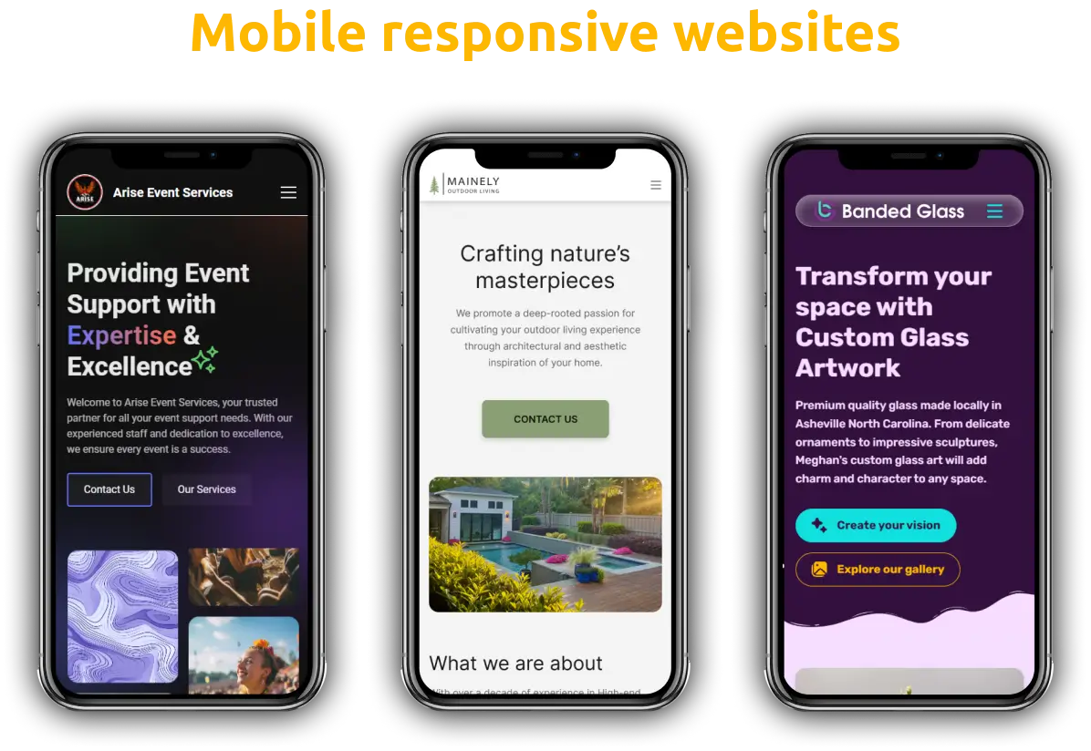
Mistake 3: Not Mobile-Friendly
Explanation:
With more than half of web traffic coming from mobile devices, having a mobile-responsive design is non-negotiable. A non-mobile-friendly site in today's world will negatively impact user experience and your website's SEO rankings.
You'd be surprised how many websites are still in the stone ages!
Solution:
Ensure your website uses a responsive design that adjusts to different screen sizes. Test your site on various devices to make sure it looks good everywhere. Hiring a professional web designer makes sure your site works perfectly on all devices, giving every visitor a smooth experience.
Mistake 4: Slow Loading Speed
Explanation:
A slow website frustrates users and increases bounce rates. Studies show that a one-second delay in page load time can lead to a 7% reduction in conversions.
Solution:
Optimize images, leverage browser caching, and minimize code to improve loading speed. Tools like Google PageSpeed Insights and GTmetrix can help analyze and improve your site’s performance. A skilled web designer can make sure your site is running fast and smoothly.
One of my favorite image compression tools that's completely free: TinyPNG — It allows you to reduce the file size of your images without sacrificing quality.
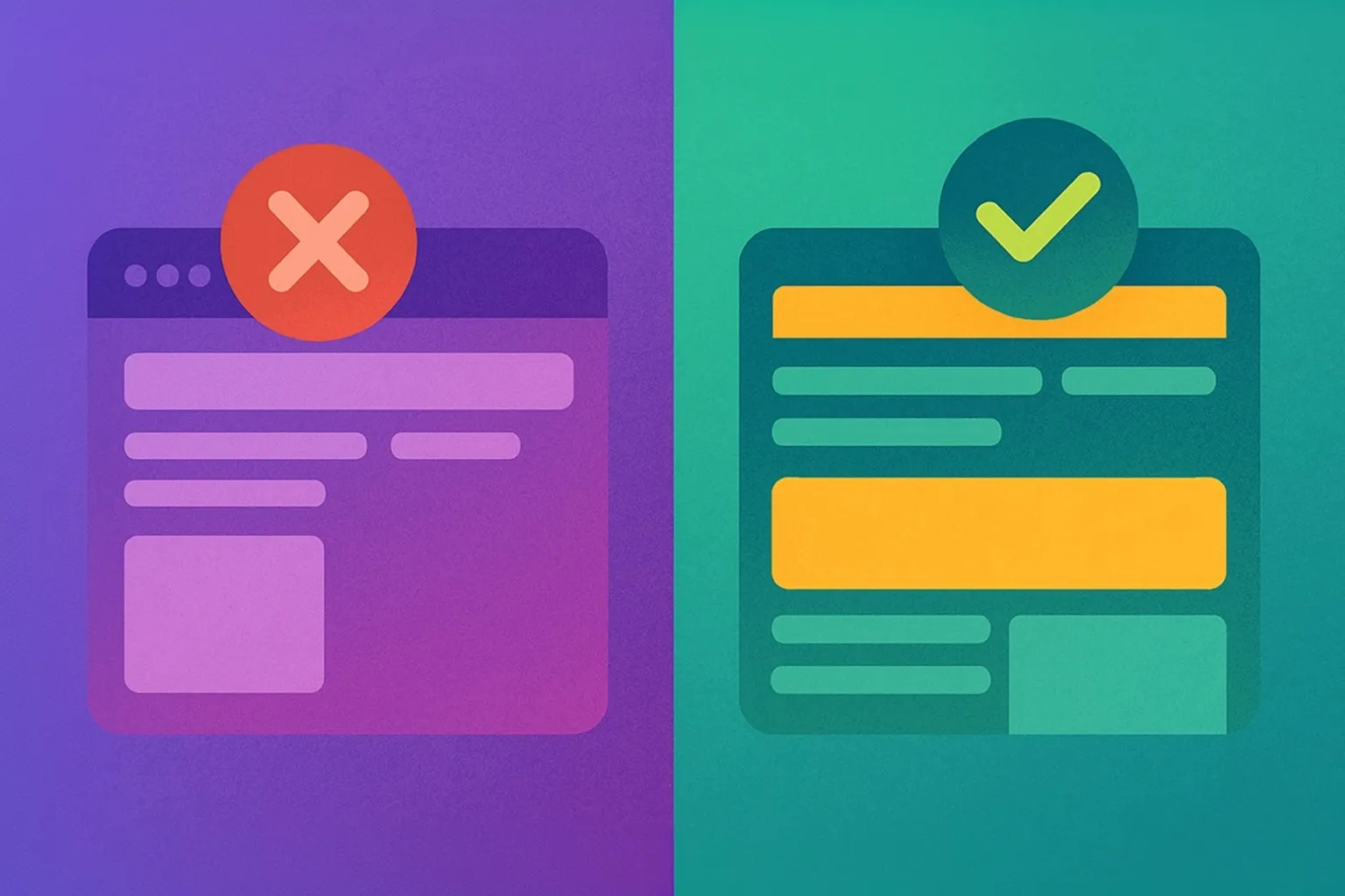
Mistake 5: Cluttered Design
Explanation:
A cluttered website with too many elements can overwhelm visitors and distract them from your core message. Simplicity is key to a good design!
Solution:
Focus on a clean, minimalist design that highlights your value proposition and key elements. Use white space effectively to make your content more readable. A professional web designer can help declutter your site, making it feel more modern and easier to use.
Example:
Relume's brand new website is a great example of minimalist design, focusing on clear visuals and concise text.
Mistake 6: Poor Call-to-Actions (CTAs)
Explanation:
CTAs are designed to guide visitors towards taking specific actions, like signing up for a newsletter, contacting a business, or making a purchase. Poorly designed CTAs can lead to missed conversion opportunities.
Solution:
Use clear, action-oriented language for your CTAs and place them strategically throughout your site. Make sure they stand out with contrasting colors. A professional web designer can craft compelling CTAs that drive user action and boost conversions.
Example:
Instead of your newsletter sign up button saying "Submit," you could instead use actionable phrases like "Get Your Free Guide," "Never Miss An Episode," or "Start Your Free Trial."

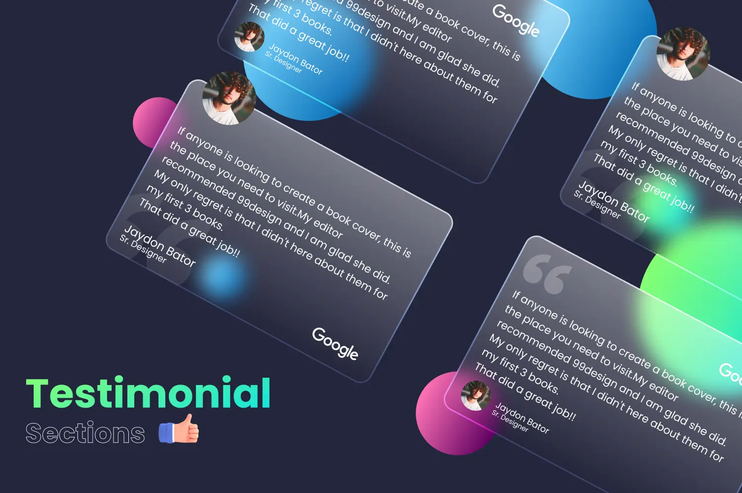
Mistake 7: Lack of Social Proof
Explanation:
Social proof is a powerful tool that can significantly impact a visitor's decision-making process. It includes elements like testimonials, reviews, and case studies, which serve to build trust and credibility for your business.
Without these elements, potential clients may feel uncertain about your reliability and hesitate to engage with your services. Social proof reassures visitors that others have had positive experiences with your business, making them more likely to trust and choose you.
Solution:
To effectively utilize social proof, incorporate various forms of it prominently on your website. Here are some strategies:
- Testimonials: Feature testimonials from satisfied clients on key pages, such as your homepage, service pages, and a dedicated testimonials page. Ensure they are detailed and specific, highlighting the benefits your clients have experienced.
- Reviews: Include reviews from third-party platforms like Google, Yelp, or industry-specific sites. Display these reviews in a dynamic format, such as a rotating carousel, to keep the content fresh and engaging.
- Case Studies: Develop detailed case studies that showcase how your services have helped clients achieve their goals. Use real data and tangible results to illustrate the impact of your work.
- Awards and Certifications: Highlight any awards, certifications, or recognitions your business has received. These accolades add an extra layer of credibility and also demonstrate your expertise/authority in your field.
- Client Logos: Display logos of well-known clients or partners you’ve worked with. This visual representation of your client base can quickly convey trustworthiness and industry recognition.
A professional web designer knows the importance of social proof and can integrate these elements into your site's design.
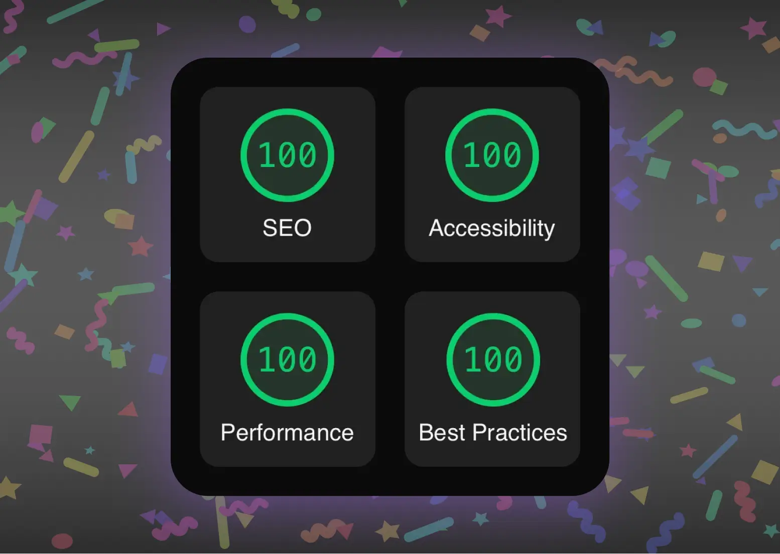
Mistake 8: Ignoring SEO Best Practices
Explanation:
SEO is crucial for driving organic traffic to your site. Ignoring SEO best practices can result in poor search engine rankings and reduced visibility.
Solution:
Implement basic SEO best practices, such as keyword optimization, meta tags, and alt text for images. I'd recommend you use tools like SEMrush and Moz to help optimize your content. A web designer with SEO expertise can ensure your site is search-engine friendly.

Mistake 9: Ineffective Content
Explanation:
Content is king, and good content makes a big difference. If your content is poorly written, irrelevant, or outdated, visitors will leave and it’ll hurt your credibility. High-quality content keeps your audience engaged, builds trust, and boosts conversions. Without it, people will quickly leave your site, which can hurt your search engine rankings.
Solution:
To make sure your content is effective, follow these strategies:
- Create High-Quality Content: Focus on producing well-written, informative, and engaging content that resonates with your target audience. Use clear, concise language and avoid jargon that might confuse readers.
- Relevance: Ensure your content addresses the needs, interests, and pain points of your audience. Conduct research to understand what topics are most relevant to them and tailor your content accordingly.
- Regular Updates: Keep your content fresh and up-to-date. Regularly review and revise existing content to reflect the latest information and trends in your industry. This not only maintains your site's relevance but also signals to search engines that your website is active and current.
- Content Strategy: Develop a comprehensive content strategy that aligns with your business goals. This strategy should include a content calendar, outlining when and what type of content will be published. Consistent posting schedules help build and maintain audience engagement.
- Visual Elements: Incorporate visuals such as images, infographics, and videos to complement your written content. Visual elements can make your content more appealing and easier to digest.
Hire a web designer who can help you develop an effective content strategy that aligns with your business goals and engages your audience.

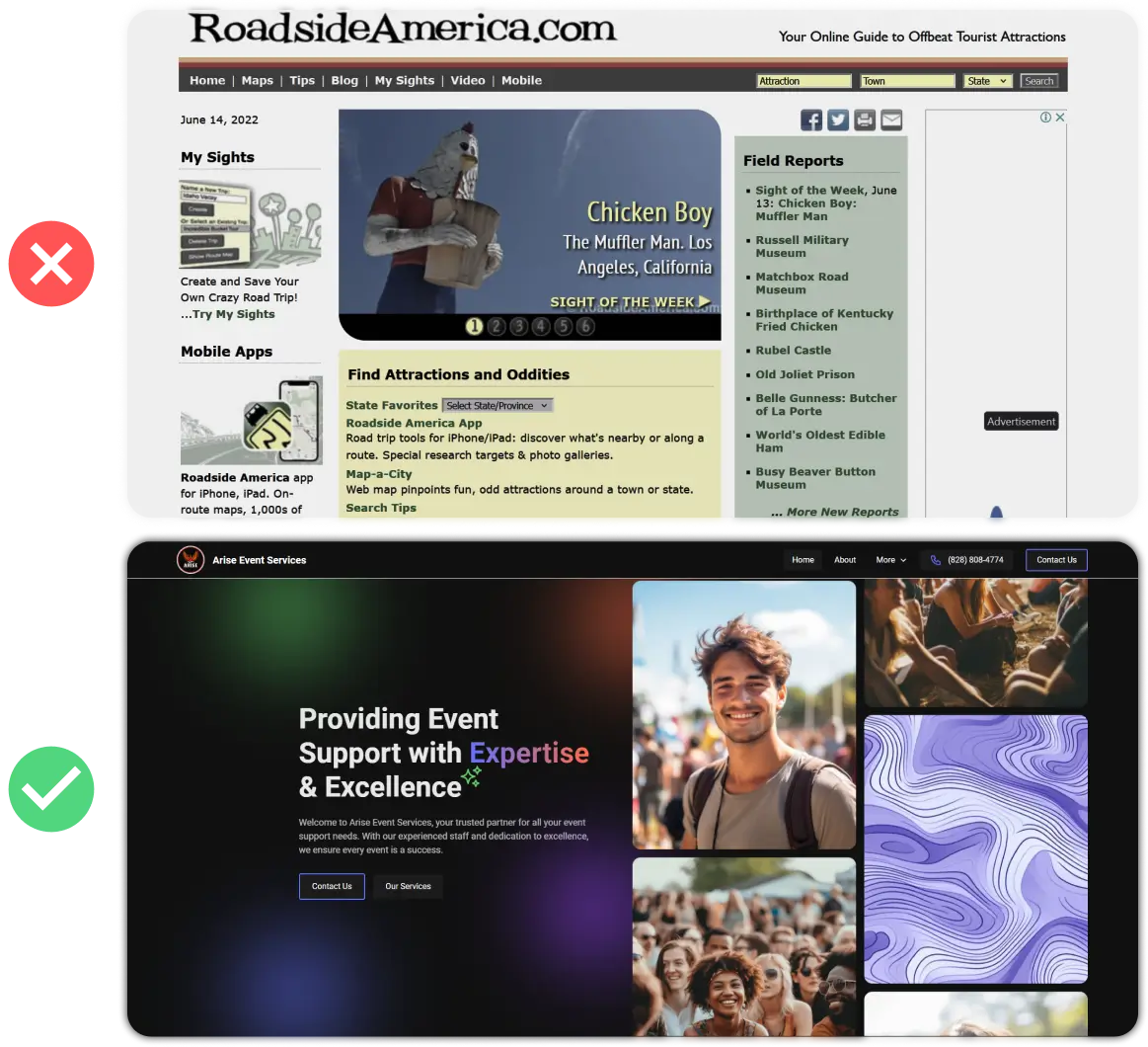
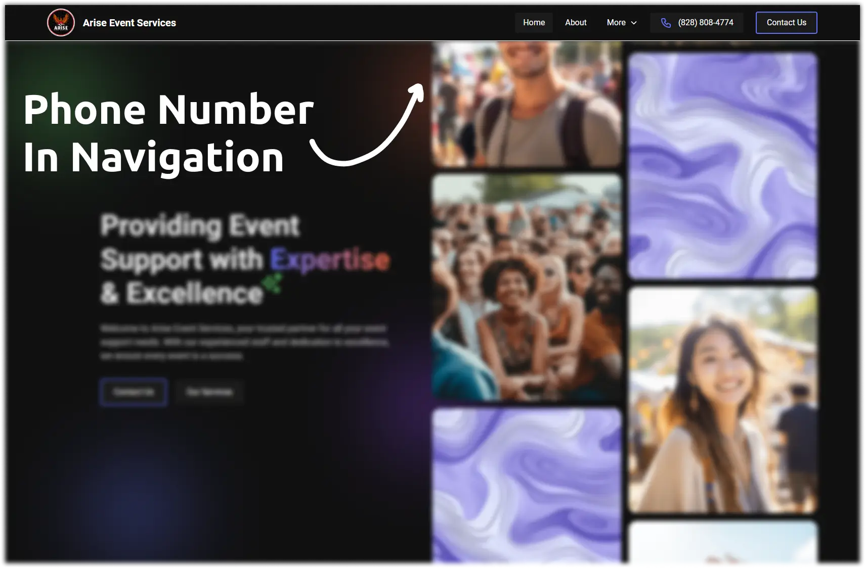
Mistake 10: No Clear Contact Information
Explanation:
No matter what kind of business you run, visitors need an easy way to contact you. If your contact information is hard to find or incomplete, you could be losing potential business opportunities.
Solution:
Make sure your contact information is prominently displayed on your site. You should always include multiple ways for visitors to reach you, such as a contact form, email address, and phone number. If your businesses contact information is difficult to find, tell your web designer to quickly update your contact page and navigation to make it easy for visitors to get in touch.
Best Practices for Service Providers:
Place your contact information in the header and footer of your site, in addition to the contact page for easy access.
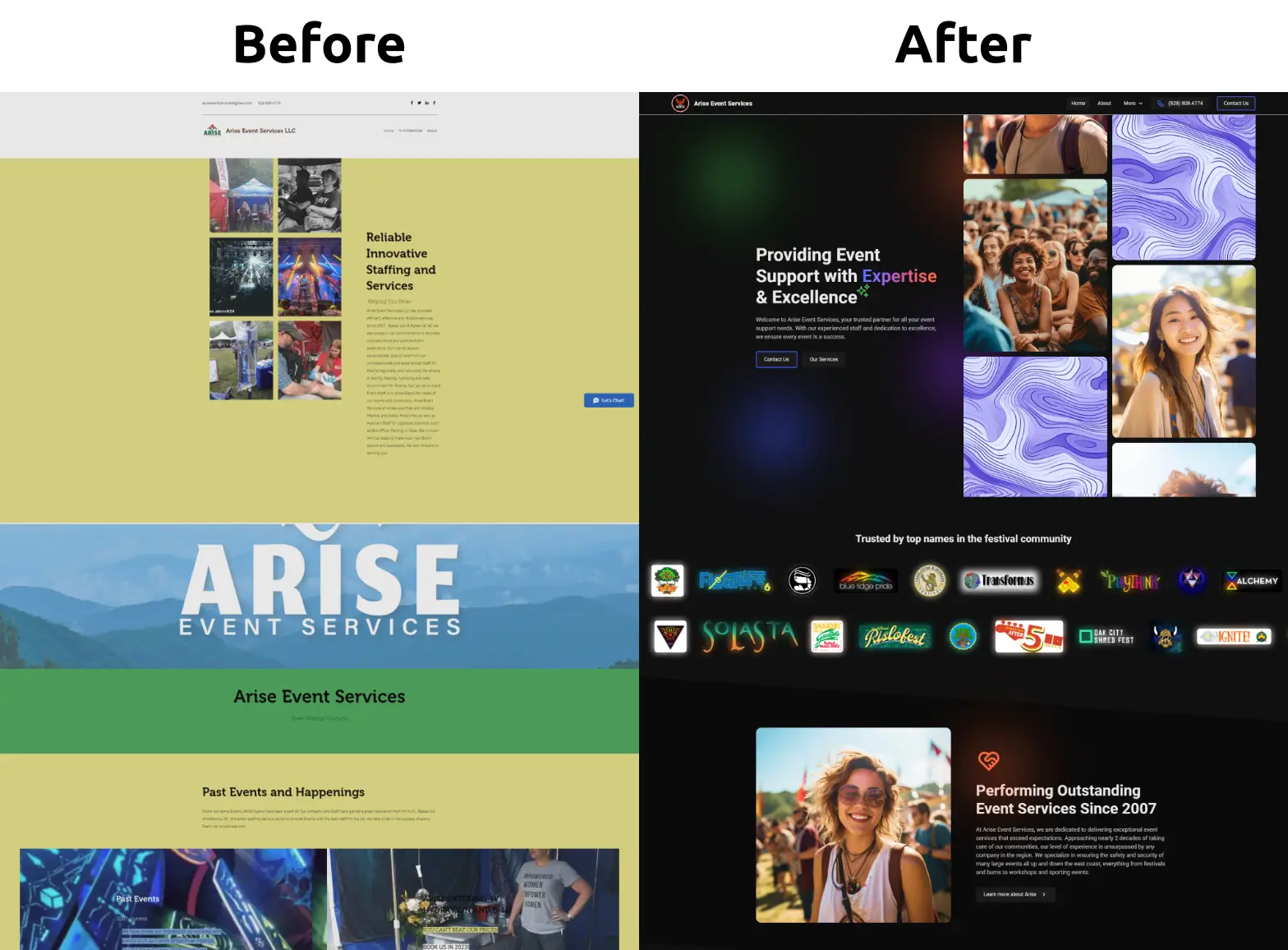
Mistake 11: Inconsistent Branding
Explanation:
Consistent branding is key to building recognition and trust for your business. When your branding is all over the place, it can confuse visitors and make your business seem unprofessional.
Solution:
Keep your branding consistent across your website by using the same colors, fonts, and images that reflect your brand identity. This means making sure your logo, brand colors, and typography are the same on every page. I've transformed many Wix and Squarespace websites with inconsistent branding, and after launch, my clients have seen significant results from their updated websites.
Case Study: Here's a before and after look at Arise Event Services, a local Asheville company who's seen significant results from their new website and branding.
See the full case study here, or check out the live website for yourself.
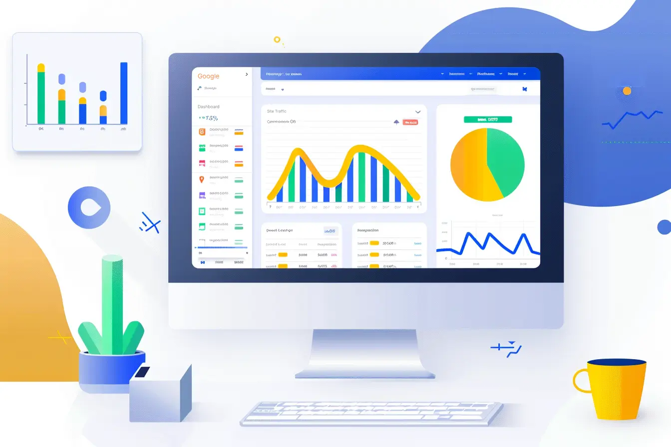
Mistake 12: Neglecting Website Analytics
Explanation:
Analytics are crucial for understanding user behavior and website performance. Neglecting website analytics can result in missed opportunities for improvement.
Solution:
Set up and use analytics tools like Google Analytics to track key metrics such as bounce rate, conversion rate, and user behavior. Managing your analytics as a business owner can be exhausting. Teaming up with a web designer ensures these tools are smoothly integrated into your site, and they can provide valuable insights to help you optimize your site. Have them regularly review your Google Analytics dashboard to identify trends and areas for improvement.
Mistake 13: Poor Readability and Typography
Explanation:
Readability and typography significantly affect user experience. Poor font choices, bad text formatting, and colors that aren't friendly to color-blind users can make your content hard to read and ultimately impact your SEO.
Solution:
Select fonts that are easy to read and ensure proper text formatting. Use sufficient contrast between text and background colors. Good web designers understand the importance of readability and can help improve the overall user experience.

Mistake 14: Overloading with Ads and Pop-Ups
Explanation:
Excessive ads and pop-ups can negatively impact user experience, cause content layout shifts, drive visitors away, and reduce conversions. While monetization is important for your bottom line, overusing ads can end up costing you more money than they bring in.
Solution:
Balance monetization with user experience by limiting the number of ads and using pop-ups sparingly. A professional web designer can optimize ad placement to minimize disruption and those annoying layout shifts.

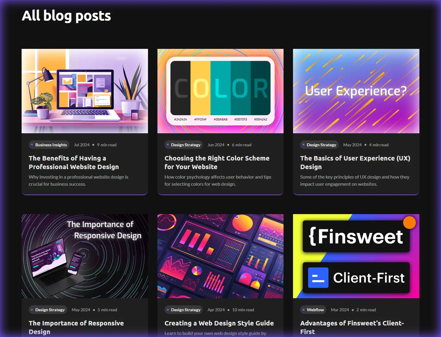
Mistake 15: Failing to Update Content Regularly
Explanation:
Fresh content is essential for both SEO and user engagement. When content becomes outdated, it can harm your site's credibility, making visitors less likely to trust your information. Additionally, search engines favor websites that consistently provide new and relevant content, meaning that neglecting to update your site can lead to a significant drop in traffic and lower search engine rankings.
Solution:
To keep your website current, create a content update schedule. This can include regular reviews and updates of existing content, as well as the addition of new material.
Consistently publishing new blog posts, adding recent case studies, or showcasing updated testimonials can keep your site fresh and engaging. A good web designer can help you set up a content management system (CMS) that makes it easy to manage and update your content.
Mistake 16: Ignoring Accessibility Standards
Explanation:
Making your website accessible to all users, including those with disabilities, is crucial for creating an inclusive online experience. Ignoring accessibility standards not only excludes a significant portion of your potential audience but can also lead to legal and ethical issues.
In some cases, websites that fail to meet accessibility guidelines can actually face lawsuits and damage their reputation, as accessibility is increasingly recognized as a fundamental aspect of web design.
Solution:
Implementing accessibility standards ensures that everyone, regardless of ability, can navigate and interact with your website effectively. Here are some key practices to follow:
- Alt Text for Images: Provide descriptive alt text for all images to assist users who rely on screen readers.
- Keyboard Navigation: Ensure that all interactive elements, such as forms and menus, can be accessed and used via keyboard alone, catering to users with mobility impairments.
- Screen Reader Compatibility: Make sure your website is compatible with screen readers by using proper HTML semantics and ARIA (Accessible Rich Internet Applications) landmarks.
- Contrast and Text Size: Use sufficient contrast between text and background colors and allow users to adjust text size to improve readability.
- Accessible Forms: Design forms with clear labels and instructions, and ensure they are navigable via keyboard.
- Captions and Transcripts: Provide captions for videos and transcripts for audio content to assist users with hearing impairments.
Mistake 17: Ineffective Use of Visuals and Media
Explanation:
Poor use of images, videos, and other media can detract from your message and slow down your site. When visuals are not used effectively, they can confuse visitors and disrupt the flow of information. Additionally, large, unoptimized media files can significantly slow down your site's loading times, negatively impacting SEO rankings and causing visitors to leave before your content even loads.
Solution:
Use high-quality, relevant visuals and media. Optimize media files to ensure they load quickly. Professional web designers understand the importance of strategic placement and consistent style for visuals.

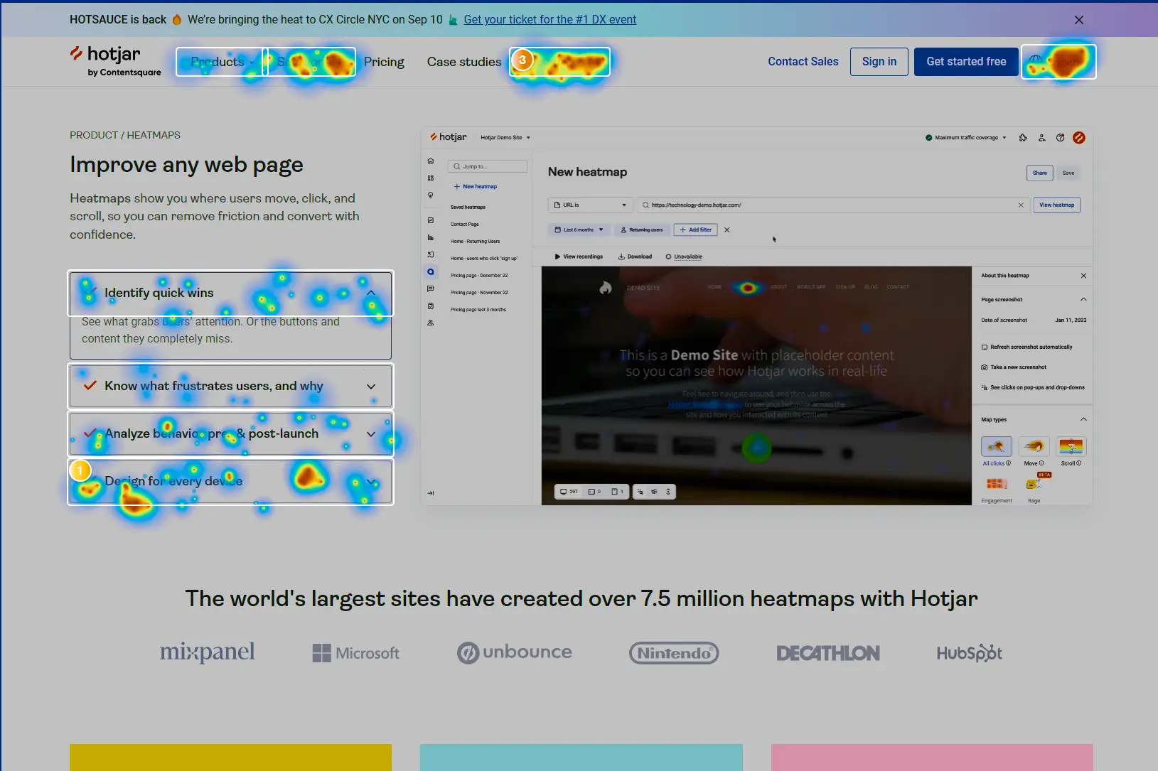
Mistake 18: Lack of User Testing
Explanation:
User testing is essential for identifying usability issues. Launching a website without proper testing can lead to a poor user experience, as you may miss critical problems that frustrate visitors and make it hard for them to navigate your site.
Solution:
Conduct thorough user testing to gather feedback and find areas for improvement. This should include real users interacting with your site to spot issues and understand their behavior.
Tools like Hotjar are great for this, providing heatmaps and session recordings that show how users interact with your site.
Wrap-up
Avoiding these common website mistakes can significantly improve your site’s performance, user experience, and conversion rates. By addressing these issues, you can create a more effective and engaging website that drives business growth. Hiring a professional web designer can save you time and ensure your website is optimized for success.
Need help with your website? Reach out to me—I’d love to help you create a website that avoids these common pitfalls and drives results for your business!

More recent insights


Stand out from the crowd, and take center stage
Your website is your 24/7 salesperson. Let’s make sure it's saying the right things.